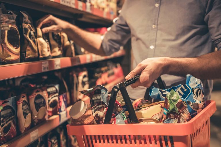
The coffee industry will always offer big money to the most successful brands because coffee will never go out of style. We all want that perfect product for our morning coffee, and there are so many to choose from. But, this also means that there is a lot of competition for any new brands and many players with great custom coffee packaging. So, how can you stand out on the shelves?
What colour should you use for your custom coffee packaging?
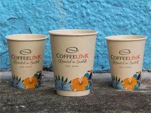
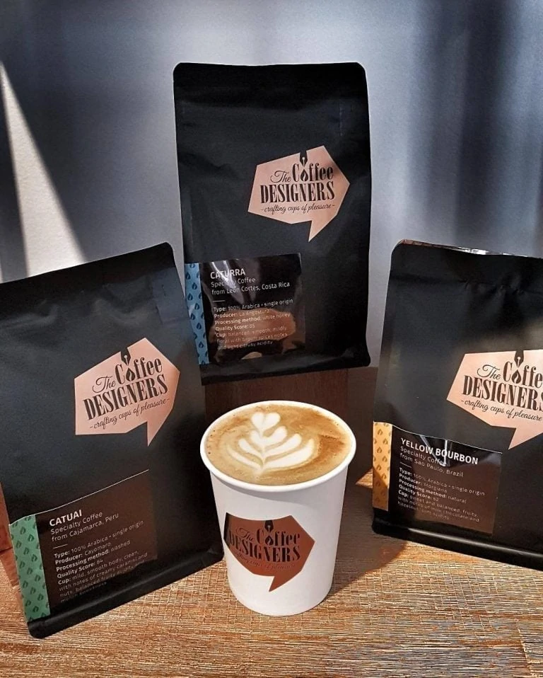
You are going to compete with some of the biggest names in coffee, and colour is an important part of your brand. Starbucks has a distinctive shade of green; Costa has that deep maroon-red. So, when you see bags of ground or boxes of pods from these companies, you hone in on the colour. That’s what you are aiming for. You want customers to see your tell-tale colour and to go straight for it in a store.
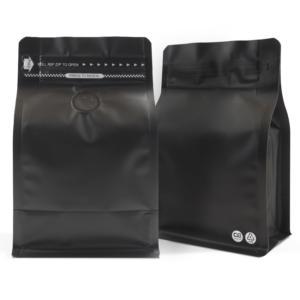
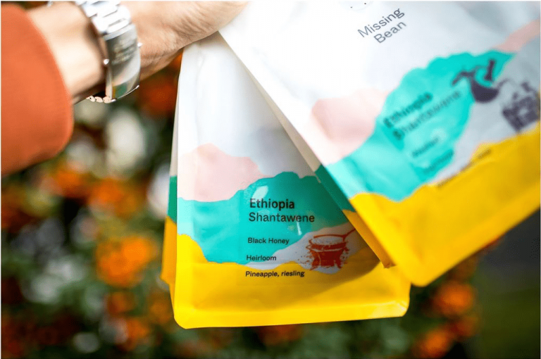
The common choices are reds, greens, black, and gold. Black makes us think of intense black coffee while gold is opulent for luxury brands. However, purple is also associated with wealth and the finer things in life. So why don’t we see more purple coffee packaging? We could help you find the ideal shade for your high-end brand with our custom coffee packaging. Or, we could look at a more natural, earthy tone or a fun pastel pink or blue to take the mood in a new direction.
How can your custom coffee packaging say something about your brand?
What is your unique selling point as a brand? Does it lie within the flavours of the coffee, the origin of the beans, some eco-friendly credentials, a family story, or something else? These USPs should come across on your coffee packaging as quickly as possible. If consumers are looking for a brand that meets specific criteria, they shouldn’t have to examine every bag with a magnifying glass for answers.
So, consider the following:
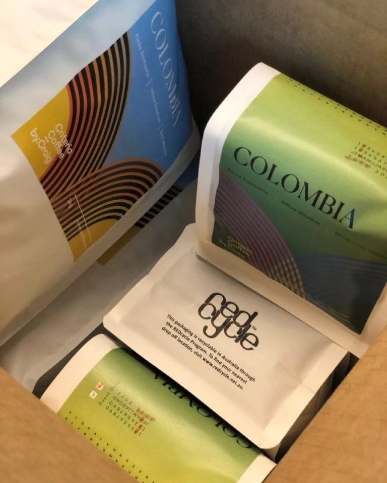
- If you have a greener conscience, highlight those credentials and play into the “green” packaging.
- If you grow your beans in an unusual location, use that in your design. Buyers could be bored with Italian or South American options and be intrigued by a Spanish flag or a UK map.
- If this is a family business or a young start-up, don’t be afraid to add a family photo or something else to represent this fact.
It is all about doing something different that will grab a buyer’s attention. That immediate response doesn’t have to be “that looks tasty” or “that looks pretty”. Starting with “that looks interesting” or “that looks unusual” can work just as well.
Coffee making is a sensory experience.
It is easy to focus on the colour and visual of your package and forget that visual stimulation is just a small part of the experience.
Coffee making is also about:
- the smell of the grounds or beans as they brew in a coffee maker
- the sound of the machine and maybe also that crinkle noise you get from the right type of bean
- the feel of the weighty grounds in your hand and of getting that scoop ready for the machine
In fact, a study of college students in South Africa in 2015 found that scent was just as important in their experience in coffee houses as sight. Coffee drinkers are drawn in by the nose. While we can’t do this so easily in a store with sealed bags of grounds, we can get an idea of what it might be like to smell the coffee when it brews.
One way to do this is to think about the design of your bag and how it represents the aromas of the coffee. It is all too common to have pictures of coffee beans or steaming hot cups of coffee on the front. But, what if there is a sweet caramel note or something else that makes the coffee stand out. Showcasing this on the packaging immediately shows that you have something a little different. At the same time, you are highlighting the flavour notes to entice buyers further.
As for the sound and the feel, our team at The Bag Broker can help you find the perfect coffee package to enhance this experience. A matte look to the packaging could stand out as being nicer in hand.
Whatever you choose, you need to be consistent with all your packaging.
It could be that you have a few different products in your line reflecting different intensities or flavour notes. Perhaps you have a deep, dark roast, a lighter option, and something for a wider consumer base. Whatever your options, it needs to be clear that each version comes from the same brand. Your brand identity should be clear from first impressions, and then they can determine which type of coffee to get.
So, if you want to focus on brand recognition with a specific colour – such as that luscious purple or pastel pink – don’t deviate from that hue. Instead, use it at every possible opportunity with packaging, branding, and social media. Use the graphics on the bag to determine the difference between the options.
However, if you want to focus on graphics rather than colour for impactful branding, you can go in the opposite direction. Maintain the same strong imagery for your company on all packaging, but adjust the colours to correspond with different flavours or intensities.
Trust us to help you create the best custom coffee packaging for your coffee brand.
As you can see, there are different directions that you can take to make your brand stand out from the crowd. Also, don’t forget that when something works, it is worth sticking with it for brand recognition. Don’t be like Tropicana. In 2009 they removed their iconic orange and straw design for the Northern American market. Sales plummeted until they reverted back. We can help you find your version of the Tropicana orange or the Starbucks green to stand out on the shelves.
